4.
Tuesday, 24 September 2013
Organisation for Pre-Lim and Main Task
October
1 - Take and decide which picture would be best suited for the front cover of my pre-lim task
2 - Finish the preliminary task by the end of October
November
1 - Begin to generate thoughts on the target audience of my music product and write a mock of a typical reader of the magazine
2 - Look and analyse the conventions of music magazines and develop ways in which i could defy the conventions in my own magazine.
3 - Find style models of the same genre and target audience of my magazine and do some analysis and research
December
1 - Organise a date for a photoshoot and take first drafts of some possible cover images
2 - Develop knowledge of front cover conventions and possible do a presentation
3 - Begin work on all three templates. Front Cover, Contents Page and Double Page Spread.
January
1 - Improve knowledge on conventions of double page spreads and contents pages
2 - Continue work front cover, contents page and double page spread.
February
1 - Get audience feedback on social networking sites to discover what the real audience of my magazine think.
2 - Begin improvements based upon audience feedback
March
1 - Finish all three templates and make final touches
April
1 - Begin evaluation questions
Monday, 23 September 2013
Draft Images For Pre-Lim Task
2. This shot was taken in the sixth form common room in the school. I chose this location because it shows of apart of the school. The model looks happy which should convey to the audience that this is a happy school. Again this image is in the centre so its not ideal for my magazine cover
3. This image was taken outside of the schools front door. Although i like the location it isn't obvious that its a school environment, therefore the text i put with it would be crucial to telling the audience that its a school magazine. The model doesn't look happy which would show the audience that he isn't happy at this school, which is not a good message to portray.
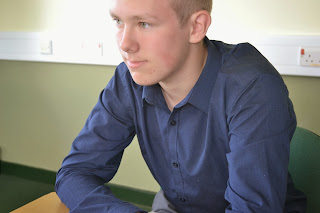
4. This image was taken in the school library. I chose this location because it shows that the school has resources to help their children learn and that they also want to encourage more reading. This image was set up to portray that the boy is reading and doing extra work. The natural light coming in through the window enhances its brightness and makes the audience feel like the school is a bright and happy place. i also used the rule of thirds in this images which would allow me to add my text easily as there is available space.
These are my draft images for the pre-lim task of creating a school magazine cover. Although i think these images are OK and follow the brief because they're medium-close up shots, most are centered therefore they would be difficult to put on a portrait magazine because there would be no space for my text to go and it isn't always clear that its a school environment. For future images i should make sure to follow the rule of thirds which should make my pictures stand out more.
Subscribe to:
Comments (Atom)


